
Most Recent Projects.

Hilltopper Creamery
The rebrand involved creating a new logo design, packaging, marketing materials, social media, signage, and online platforms to establish a strong and memorable brand presence. Additionally, engaging the local community through events, partnerships, & promotions in an aesthetically pleasing way helped generate buzz and support for the Creamery, fostering a positive perception and ensured sustained growth.
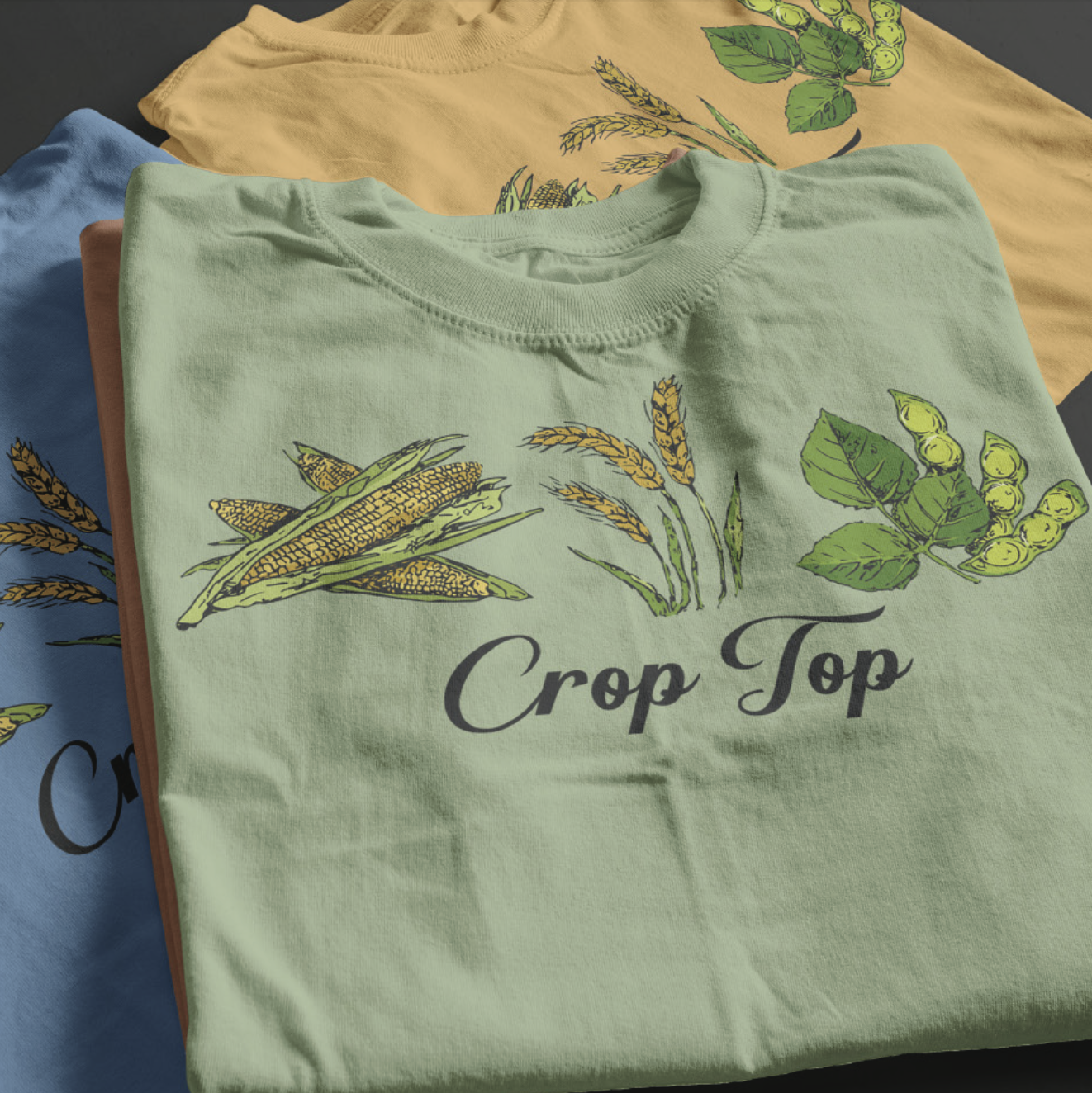
APPAREL & COLLATERAL
Personalized apparel was made for the Creamery with information about the farm in the form of trendy styles. This appealed to the college audience with this being our main target audience. Shirt slogans like “Legen-dairy,” “Talk Curdy to Me,” and “Have a Gouda Day” made the apparel irresistible for all age groups and got the crowd excited about the once hidden location.
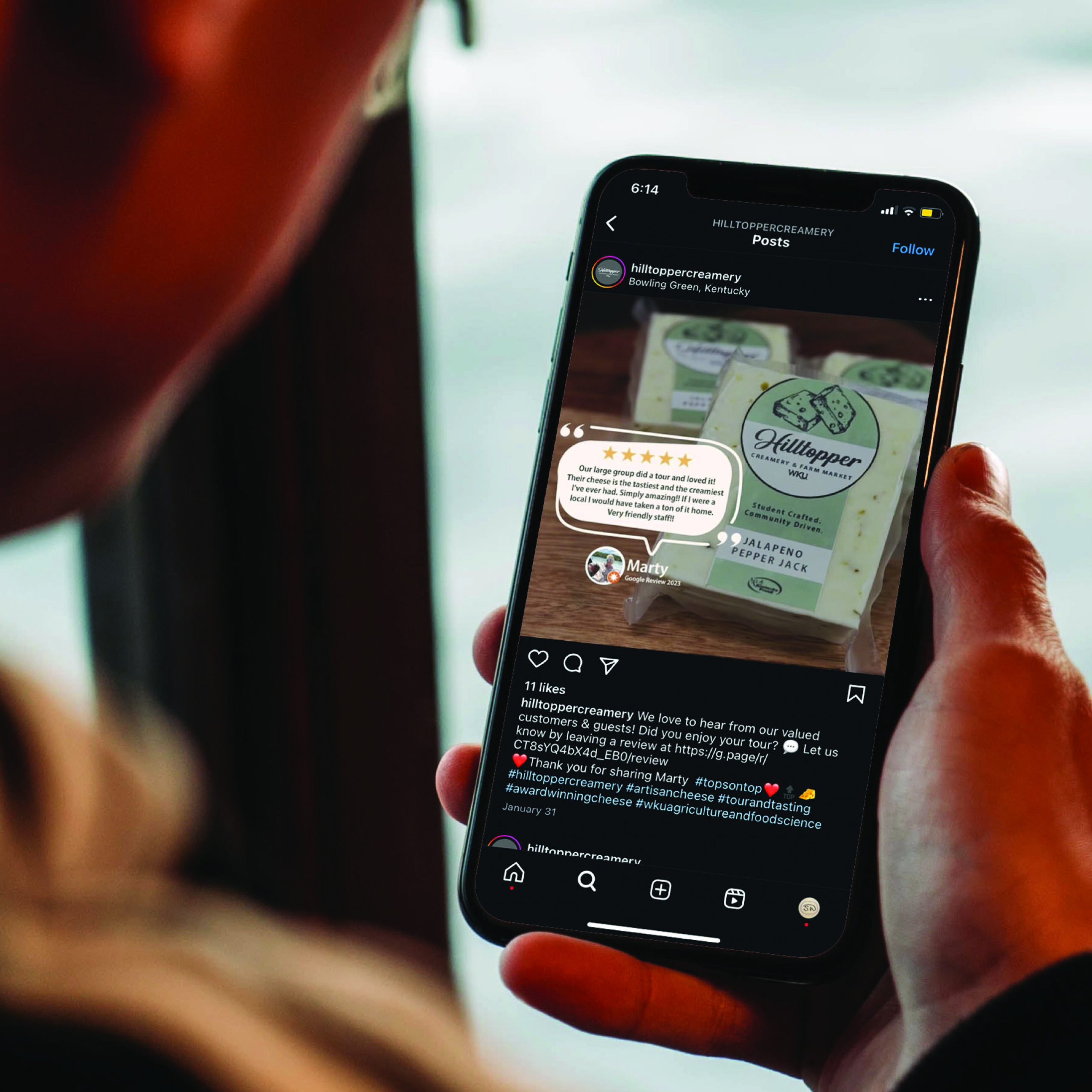
SOCIAL MEDIA & WEB
Hilltopper Creamery made an appearance across social media platforms along with a new Shopify website design. Faculty all emails were sent out updating customers about our products. We took to Instagram, Facebook and YouTube with trendy videos and photo updates engaging the audience with the odds and ins of the WKU farm and Creamery life.
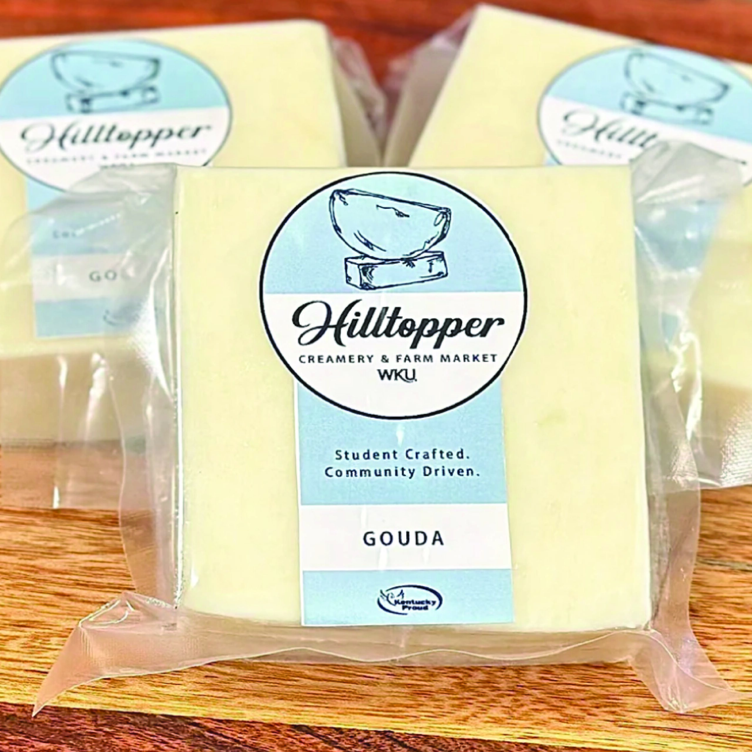
PACKAGE DESIGN
The new label sticker design was efficient in differentiation between the flavors and helped customers see exactly what they were buying. All of the different flavors were color coordinated and had unique hand drawn illustrations per package. Not only were they easy to read and aesthetically pleasing to view, but memorable for customers and kept the audience coming back for more!

Odd Duck Diner
The prototype created for “Odd Duck Diner” consists of several pages that consumers can access along with deals and weekly events for users to interact with and indulge in. This website consists of a home, menu, about us, contact page, events/news, a gallery, reviews/testimonials, and of course an online ordering page. This prototype would help the hypothetical business create a user-centric, efficient, and successful mobile application. Along with mobile, customers can also place orders online from a desktop computer.
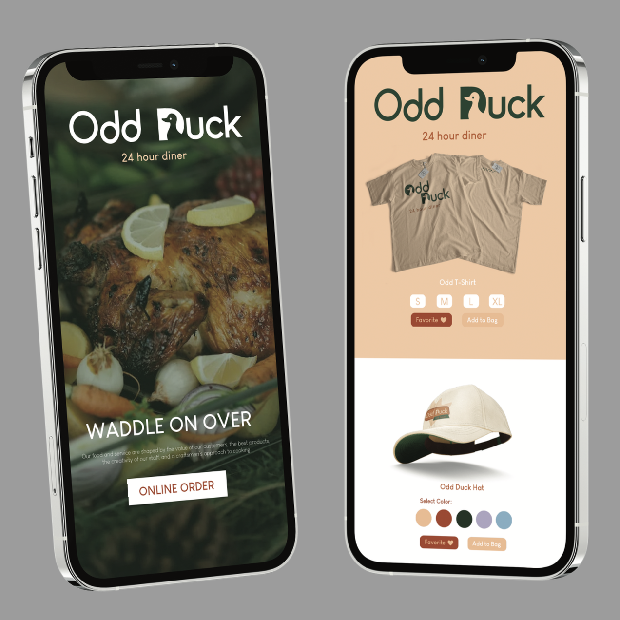
MOBILE PHONE DESIGN
Odd Duck’s mobile phone layout is designed to be straightforward and user friendly. This would allow the customer to find exactly what they are looking for with a simple click of a button.
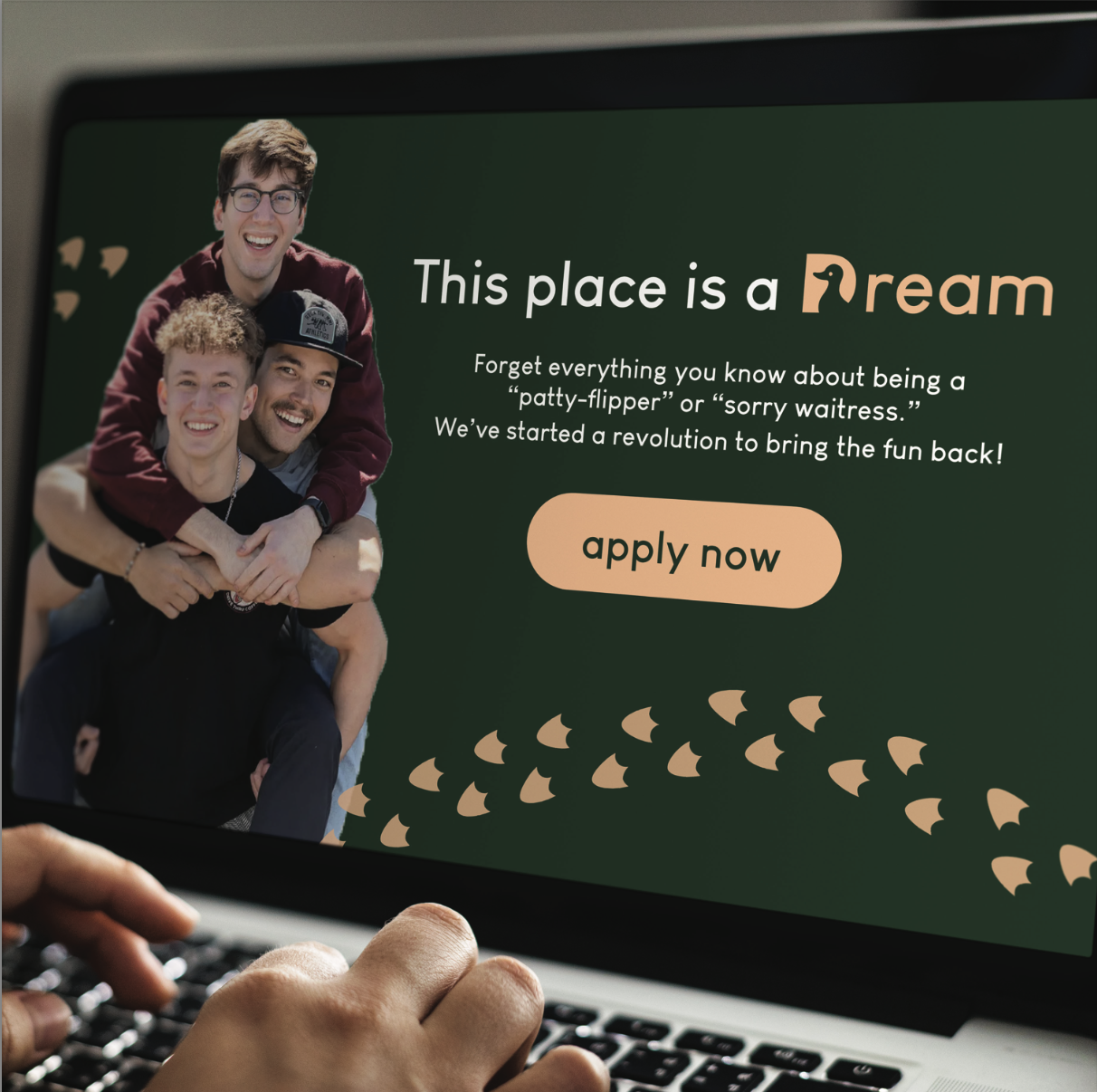
WEBSITE DESIGN
Odd Duck’s website layout is designed very similarly to mobile in order to keep the brand consistent and versatile. The website included high quality images and fun graphics to take the viewer from page to page.
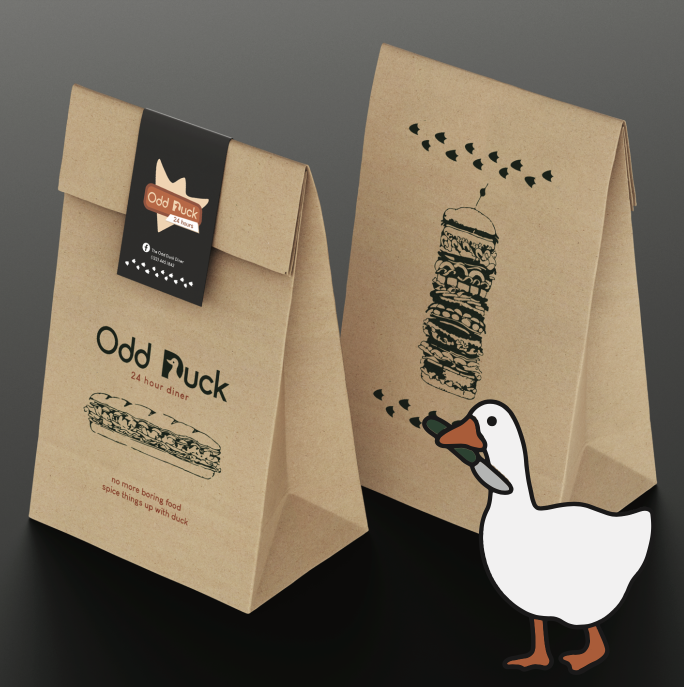
PICK-UP BAG DESIGN
Collateral was designed to strengthen brand recall and leave a lasting impression on the audience. This included dine-in and to-go packaging, apparel, signage, and more. All of the designs were cohesive and consistent.

XENO Skateboards
Skateboarding is more than just a pastime; it’s a declaration of independence. It’s a journey of self-discovery to carve your own path and break free from the confines of our daily lives. Our skateboards are crafted with the spirit of “xeno,” allowing riders to explore and connect with their surroundings while strengthening their determination and self-expression.
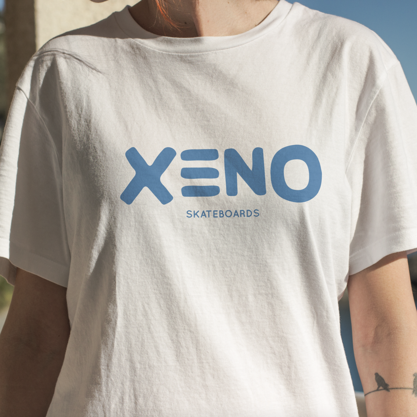
APPAREL & COLLATERAL
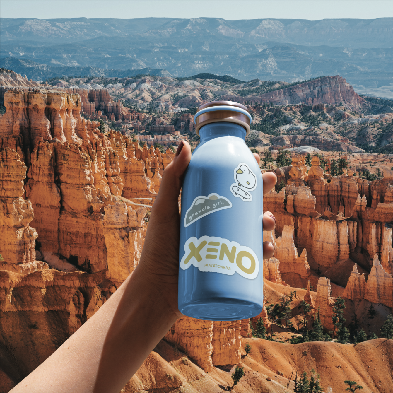
Simple shirt and collateral designs were created along with the skateboard to help build brand awareness. This would help consumers recognize XENO and keep them coming back for more.
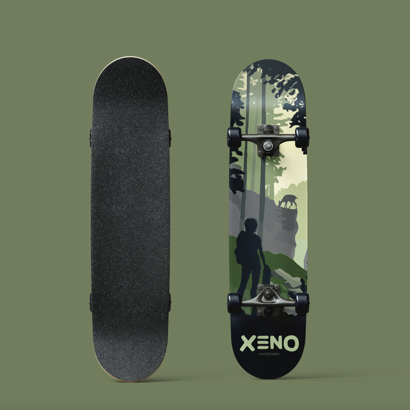
SKATEBOARD DESIGN
The brands’ skateboard design features the spirit and mission of XENO. Harnessing the essence of finding your independence while being one with nature. Many different designs were made featuring scenic routes that are off the beaten path taking riders to exciting new places where nature thrives. Showing Earths beauty in sunsets, beaches, forests, and wildlife.
TARGET AUDIENCE
After researching what type of person XENO would inspire, collateral was designed towards the desired consumer. In this case: cute stickers on a trendy Gen-Z water bottle. Other collateral included apparel, keychains, decor, and even brochures of travel getaways to help the customers journey, providing touch points that persuade and educate.